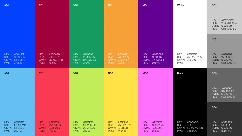
The strategic pivot to «Personal Language Trainer» was anchored by a complete redesign of the logo, where we synthesized the previous complexity into a minimalist mark to achieve higher «pregnancia» and better digital performance. This structural clarity was paired with a modular design system, a vibrant color palette, and a curated photographic style focusing exclusively on people. We moved away from cold, tech-heavy aesthetics to create a brand that feels alive and accessible, ensuring the new UX/UI prioritizes clear hierarchies and conversion-driven messaging